
Townhome of Trouble Recap
- 2CH Team
- Jul 30, 2019
- 2 min read

Updated: Aug 1, 2019
This week’s project found Karen and Mina on Talbott St. in the Old Southside neighborhood, a street where they own several other properties. Although the ladies own both sides of the townhome, they decided to renovate and sell them separately. The side of the townhome that they decided to renovate first began as a two story, 1320 sq. ft. area with two bedrooms and one bathroom. The ladies originally purchased this side of the townhome for $15,000 and decided that after revitalizing the property it would be the perfect place for downsizers or a couple purchasing their first home.
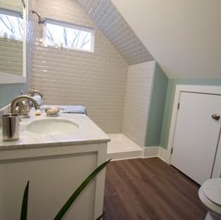
During the initial walk-through, Karen and Mina discovered that there was lots of work to be done. The house was in dire condition and featured lots of faux brick, an unstable addition on the back, and the world’s most awkward bathroom. The ladies decided to focus on opening up the downstairs, taking off the back addition, creating a master suite, and adding another bathroom.
As demolition was taking place, the team ran across an unexpected problem: this build would require new water meters and sewer lines. This was an expensive and unexpected part of the project, but it did allow Karen to have a little fun with a chainsaw when a tree had to be removed to run the new lines.
Mina and Karen design plan was essential to make the space feel trendy and unique in this up-and-coming neighborhood. They decided on a “boho-industrial” vibe. A modern-all white kitchen, exposed ducts, and vertical stairs that were utilized to open up the downstairs all brought in the industrial feel. For the boho vibe, the ladies decided on a unique backsplash tile under the bar and custom leather pulls on the cabinets that were made in a local leather shop.
If you are interested in shopping the items used in this episode or in this photo, check out the resource guide for this episode.
For more photos from this house, check out the Two chicks and a Hammer Pinterest page for the Season 4 board.


OPEN88 hôm trước mình ghé thử cho biết vì thấy mọi người nhắc hoài, kiểu vào xem giao diện ra sao thôi chứ chưa tính chơi gì. Ấn tượng đầu tiên là phần nhìn làm khá “đã”, đồ họa 3D nhìn mượt nên kéo qua lại không bị rối mắt. Mình thích cái cách họ bố trí trang chủ theo từng khối thông tin, nhìn gọn gàng nên lướt nhanh vẫn hiểu đại khái đang có gì. Menu cũng đặt dễ thấy, bấm vài cái là ra đúng chỗ cần, không phải mò lâu. Mình không đọc kỹ mấy phần giấy phép hay chứng nhận, chỉ thấy họ có để thông tin kiểu này trên trang nên cảm giác cũng…
https://f168.tech/ dạo này thấy bạn bè nhắc hoài nên mình bấm vào nghía thử cho biết. Mình không chơi gì cả, chỉ xem giao diện với cách họ trình bày thông tin thôi. Cảm giác đầu tiên là trang load khá nhanh, bấm qua vài mục mà không bị đứng hay giật, kiểu tối ưu ổn nên lướt cũng đỡ khó chịu. Có một chỗ mình để ý là phần bảo mật họ ghi rõ kiểu mã hóa SSL với xác thực hai lớp, nhìn vậy cũng yên tâm hơn chút khi đọc thông tin. Nói chung bố cục nhìn gọn, chữ tiêu đề rõ ràng, mấy khối nội dung chia theo nhóm nên kéo xuống là thấy ngay phần…
NEW88 mình cũng chỉ ghé thử vì thấy mọi người nói nhiều, kiểu vào xem giao diện có dễ nhìn không thôi chứ không tìm hiểu sâu. Vừa mở lên thấy trang khá sáng sủa, khoảng trống vừa đủ nên nhìn không bị ngợp. Mình để ý cái menu đặt ngay chỗ dễ thấy, bấm qua lại mấy mục khá nhanh, không phải kéo lên kéo xuống hay mò mãi mới ra. Mấy phần thông tin họ chia theo khối rõ ràng, nhìn lướt là biết đang ở khu nào, chữ không bị dồn một cục nên đỡ rối mắt. Nói chung cảm giác dùng vài phút thấy ổn, nhất là cách họ gom nội dung theo từng block và…
789BET mình vừa lướt thử vì thấy bạn bè nhắc, kiểu vào xem giao diện ra sao thôi. Ấn tượng đầu tiên là trang nhìn khá thoáng, không bị nhồi chữ hay màu mè quá đà nên mắt đỡ mệt. Mình hay ngại mấy site mà mở lên là rối tung, nhưng ở đây bố cục chia khối rõ nên kéo xuống một chút là hiểu đang ở phần nào. Cái mình thích là menu đặt dễ thấy, bấm qua lại mượt, không phải mò tìm nút hay quay lại hoài. Nội dung cũng trình bày gọn theo từng cụm, nhìn lướt vẫn bắt được ý chính. Nói chung cảm giác như người làm web có sắp xếp đàng hoàng,…
11cc apareceu pra mim do nada e eu entrei meio sem expectativa, achando que ia ser mais um site confuso que você fecha rapidinho. Mas acabei ficando porque a interface é bem “na lata”: as coisas ficam organizadas em blocos e dá pra sacar o caminho sem ficar abrindo mil abas ou menus escondidos. O que eu mais reparei foi o painel da conta, que não fica enrolando pra mostrar o básico — histórico de apostas e movimentações aparecem bem visíveis, com um jeito bem transparente de apresentar. Também curti que o visual é limpo, sem excesso de informação piscando, então dá pra ler rápido mesmo no celular. No fim, o que me prendeu foi justamente esse painel com ações,…